Introduction
Dev tool landing pages in 2025 win with simplicity, clarity and credible proof points.
This guide distills what actually works on developer tool landing pages today. Clean typography, centered layout, specific calls to action and visible trust signals beat flashy effects. You'll learn how to structure the hero, when to show logos or numbers, how to frame features around real problems, and which visual patterns to use (from chess layout to bento grids). Finally, we cover social proof, supporting blocks, and FAQs to cut friction and lift conversions without overdesign.
Context
A review of 100+ dev tool landing pages—from open source projects to cloud platforms—reveals strong convergence: no fluff, centered content, and value-first messaging for developers and teams. The goal is fast validation, clear utility in seconds, and immediate paths to try or learn more.
"No salesy BS."
Analysis of 100+ dev tool landing pages
"Clever and simple wins."
Analysis of 100+ dev tool landing pages
Dev tool landing pages: what works in 2025
Prioritize readability, specific messaging and credible traction. Cut the rest.
General layout
Most pages use a centered, max-width container: fast to ship, readable and trustworthy. Edge-to-edge variants can look premium but demand more craft. Solid type, simple grids and generous spacing replace heavy interactions, especially for early-stage teams. This keeps headline, visual and CTAs aligned, reduces cognitive load, and speeds iteration.
Hero section
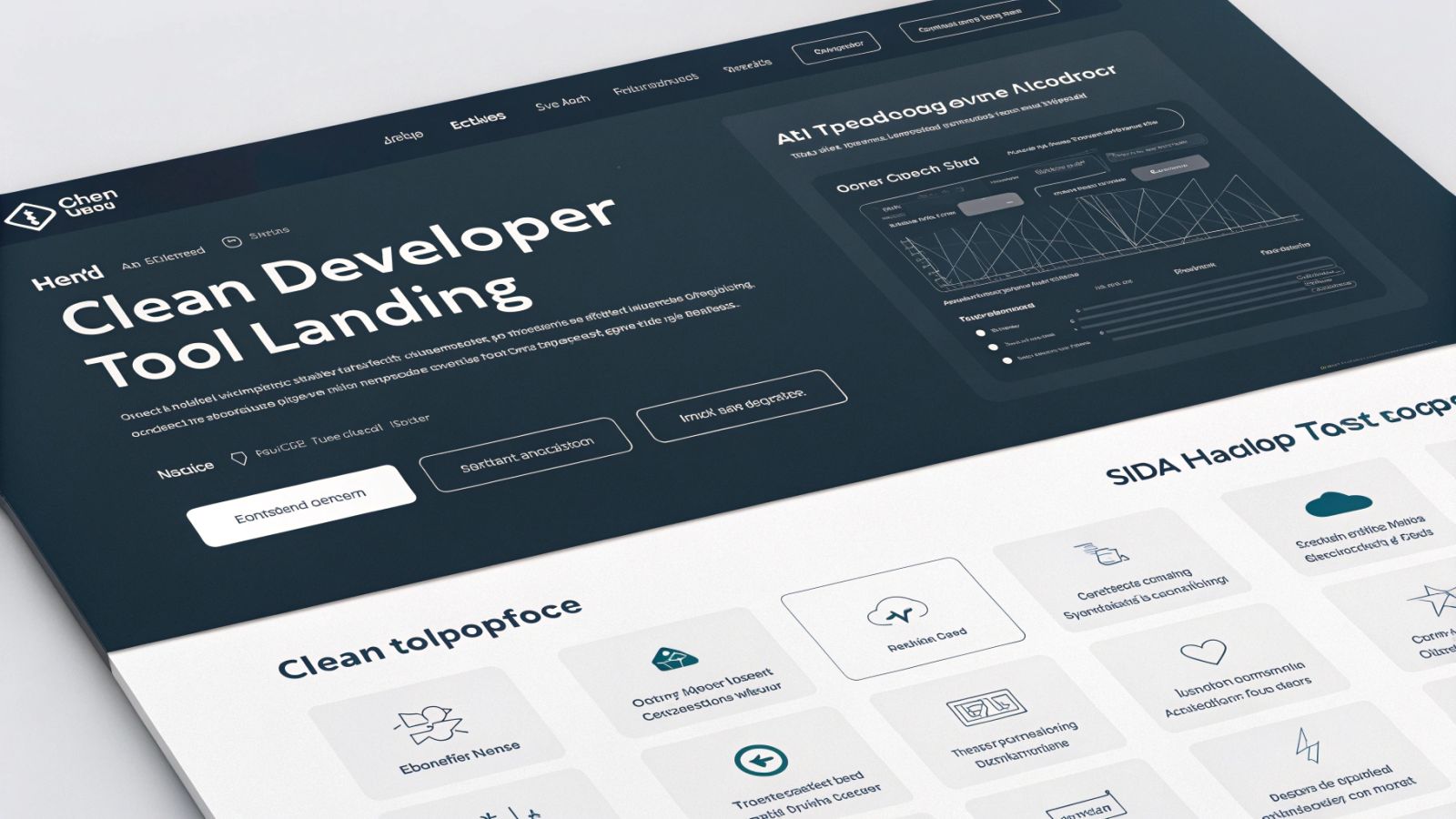
Center the composition: strong headline, product visual, two distinct and contextual CTAs.
The centered hero dominates: big headline, visual below. Visual options vary by maturity: 1) animated UI to show more surface, 2) static UI for speed, 3) switchable UIs for multiple use cases, 4) live embed for narrow utilities, 5) code snippet for libraries/SDK/infra, 6) abstract illustration or none for under-the-hood or stealth. Eyebrows and full-width banners add momentum (launches, funding, releases). Use two CTAs: a bold, specific primary ("Start building", "Download now") and a visually lighter secondary ("Docs", "GitHub", "Join waitlist") with clear hierarchy.
Trust block
Place logos or credible numbers right after the hero to build confidence fast.
For B2B products, recognizable client logos lower perceived risk; auto-scrolling carousels fit more without bloat. Alternatively, a single, well-presented testimonial works when logos are scarce. For individual-focused tools, big numbers speak: GitHub stars, usage stats, awards. Even one curated review helps—relevance and clean formatting matter more than embeds.
Feature block
Avoid feature lists; frame real pains and show how you solve them with concrete examples.
Feature storytelling
- Function list: quick but weak; no link to needs or impact
- Task/action oriented: hints use cases, often too generic
- Problem oriented: spot the pain, show the fix; more persuasive
- Bold statements: slogan-like; better for established brands
- Mission-driven: broad vision if real and credible; rare but strong
Layout formats
- Full screenshots + short copy: UI-first, let the product speak
- Chess layout: alternating text/image for rhythm and readability
- Text with icons: great for SDKs/libraries or many micro-features
- Belts: scrollable strips of cards for integrations/capabilities
- Bento grid: mixed card sizes for dense info without clutter
- Tabbed features: group by categories or personas
- Step-by-step: onboarding, setup, end-to-end numbered flow
- Rich cards: polished, premium look with more effort
- Video tutorials: effective shortcut when polished UI is missing
Add-ons that clarify the product
Help users grasp what it is, who it’s for, and how it fits their stack.
How it works
Conceptual explanations are key when there’s "magic" (AI, automation, background sync) and the UI alone can’t convey value.
Usage examples
Show real outputs (presentations, dashboards, images) to spark ideas—especially for individuals or small teams.
Compatibility and integrations
Logo walls of platforms, languages and services signal maturity and de-risk adoption by showing stack fit.
Social proof
Curated testimonials beat noisy embeds for clarity and control.
Most pages present hand-picked quotes with clean formatting (avatar, name, company for B2B). Place them near the bottom to confirm the product story. A smart twist: add mini-quotes under feature blocks for contextual proof. Early on, a single relevant sentence from a pilot user is enough.
Supporting blocks
Don’t overdo it: a clear FAQ often suffices to unblock decisions.
Comparison table
Useful in crowded markets to show same job, better execution (DX, speed). Side-by-side checks keep it crisp.
Pricing
Rare on the homepage; when present, keep plans simple (Free/Pro/Team), concise features and monthly/yearly toggle.
FAQ
End-of-page practical questions: trials, data handling, login, usage limits. Aim to reduce uncertainty and accelerate activation.
Blog or changelog
Compact previews of recent updates signal that the team ships and maintains; it’s about credibility, not clicks.
Conclusion
An effective dev tool landing page in 2025 focuses on substance: centered layout, a coherent hero with two CTAs, immediate trust, problem-oriented storytelling and proven visual patterns. Add curated social proof, clarify integrations and flows, and cap with a tight FAQ. Choose clever simplicity—it converts faster and validates your product.
FAQ
-
What is the best layout for dev tool landing pages?
A centered, max-width container optimizes readability and shipping speed.
-
How should I structure a dev tool landing page hero?
Strong headline, product visual, and two distinct CTAs (specific primary, lighter secondary).
-
When to show logos versus metrics?
Logos suit B2B; metrics like GitHub stars work for individual-focused products.
-
Which storyline converts for AI models or SDKs?
A problem-oriented approach clarifies pain, solution and value quickly.
-
How to present many features without overload?
Use bento grids, scrollable belts or tabs to group and keep visual rhythm.
-
Are FAQs useful for AI search or LLM traffic concerns?
Yes—concise answers on data, limits and access reduce friction and doubts.
